Showing posts with label graphic design. Show all posts

Friday, March 8, 2013

notes

Haven't blogged for sometime now. College and laziness.

»

I've started using Instagram. Instagram

»

SPA just had its annual students' festival, and Delhi Dallying hosted the Delhi Grub Quiz, an informal pop-up event where participants won free food for correctly answering questions on Delhi. The grub in question is the most delicious palak-chole-chawal I have ever been privileged enough to enjoy, sourced from Gole di Haati in Fatehpuri Masjid and packaged in authentic kulhars. Delicious!

Also delicious was our tagline: Know Delhi, Grow Belly!

poster for the event.
not my best effort. in fact, this was just a mock-up try. 
an initial idea was to also serve jalebis. got nixed, though.

The folks at Jobless Studio and Thinking Theorem were kind enough to help us (at the very last minute) with a short teaser video about the quiz. I think it's bloody brilliant, especially considering the fact that it was shot on an ancient point-and-shoot and, when the battery gave up (since we were so ill-prepared), a camera phone. It was shot, processed, the whole shebang, in just a day.


We were also going to call this butter coffee guy we discovered (courtesy the lovely Kriti at Turmeric) but the college ran out of funds. Made a banner for his booth, though. Will put it up later when I can locate the file.


»

Also updated my portfolio.


»


Won (!) a facebook contest to attend the launch of Anuja Chauhan's latest book. Went with my mom (we've both enjoyed her earlier books), got an autographed copy, gawked at Sonam Kapoor and fell in awe of the awesomeness that is Chauhan. The book was good too, set in 80s Delhi, offered an unusual perspective (for me) to life then. Finished reading Arthashastra, which was both very interesting and very, very, boring. Started India Unbound.

»

Volunteered for 2 days of play and learning at the UnBox Festival; helped with set-up, packed for and manned the picnic counter. Attended an URBZ workshop which explored the meaning of rural/urban. Overall, had major fun.


»


Been so bleh about college and thesis (thesis!). I've being very complacent and over-confident, almost, thinking that in the end I'll do some crap and not fail. Like I'm satisfied with mediocrity. Did work for this last submission though, so maybe I'm beyond this. Maybe.


»


Coming Monday Delhi Dallying is taking a bunch of German architecture students around CP and Barakhamabha Road. This opportunity just came up (a teacher asked us to) and I'm glad because finally we're dallying beyond Shahjahanabad. DD was always supposed to be about more than the Old Ciy but it was just so convenient and familiar. Fingers crossed for our venture into the uncharted.


Saturday, January 19, 2013

Transformer

This came by courier today, one of many that come for my dad (a builder/architect). It's an invitation/ poster for (an exorbitantly expensive) design symposium in New Delhi.

At this point I thought it was cheesy. And I was disappointed that the orange colour scheme and triangular grid on the envelope wasn't continued onto the invitation.
But then, I opened it!
It unfolded bit by bit, and surprised me. Pleasantly :)
 I love its design! It's obviously not just done on the computer, but must have required manual experimentation. I love how it's been folded crisply at all the right places, how its economical because it's only printed on one side. Most of all, I love how it makes sense at every stage and when it fully opens up. 

Monday, October 15, 2012

Seminar

I've ranted enough about work this year. Now onto some fun work stuff.

The final year students of Bachelors of Architecture at the School of Planning and Architecture, New Delhi, host a series of seminars every year. These seminars are public and are aimed at generating interest and discussion on contemporary architectural theory and practice.

Seminar Week is finally upon us and I was one of the few who volunteered to make the posters and invitations. A few discussions, many hours on adobe creative suite, a few less at Nehru Place, and here's the end product:

the poster

invitation (front)

invitation (back)

Also worked on the official blog. Had to make some more graphics for it. We chose two speech bubbles as our icon and the tagline (QUESTION. THINK. TALK.) because we wanted to emphasize that these seminars are about discussion.

This here the poster for our own seminar (Seminar 2/ By the People):

The idea was to make the poster represent a window into Shahjahanabad (or other such seemingly chaotic settlements). Rohan also worked on this brilliant video as an introduction to our seminar:

Saturday, February 4, 2012

Notes

I've joined vir.mueller architects as a trainee.

They only use the font Helvetica.
(Actually, Swis721 LT, but that's what Helvetica is called on Windows)


link via Rohan Patankar
My parents went to the US for a conference, where they met people from all over the world, and exchanged gifts. My loot: two awesome Indonesian bookmarks representing the Hindu mythology characters Srikhandi and Rama.


Found online:
here.
Currently reading What on Earth Evolved? 100 Species that changed the world by Christopher Lloyd.

Thursday, January 19, 2012

W


Wikipedia is the only source of light in a "world without free knowledge".

I think this page/ announcement works so well; it needed to be simple and to the point. I love the extreme shadow and the soft black and the Times New Roman. This is nothing dramatic or radical or ohmygodshit!, but that's probably the reason for its success.

Of course, Wikipedia is not the only site protesting. But I do think that it does it more, well, elegantly, than the others.

On an aside: never realized how often I went to the Wiki page in a day; I just instinctively click on a link or google search result and then realize a split second later that it's been blacked out.

Saturday, December 24, 2011

isabgol and licences

 
Packaging for Sat-Isabgol, which my dad has been having since forever. I think it's brilliant! So retro. Absolutely love the typography. Notice how elements are repeated on both the English and Hindi sides, especially love the 'R' of registered. It's cardboard, and the 'trademark registered' oval is embossed. And the telephone! I don't understand the significance, but I definitely like the style and the detail. Click on the image for a zoomed in view.
__
Got my driving licence! Very impressed by the authority- I gave my test yesterday morning and got it today by 3.30 in the afternoon. The envelope and the licence both have "Drive only if you must: use public transport" displayed quite prominently. And, surprised to note that Delhi Integrated Multi-Modal Transit Systems Limited is a project partner with the Transport Department.

Thursday, November 17, 2011

Notes on Design

Good design is good will.
The genius of Paul Rand.


Intent is everything.
__

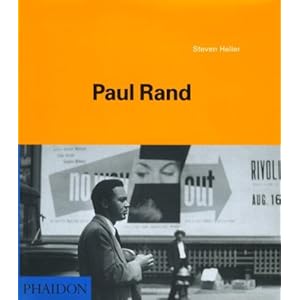
Currently reading: Paul Rand, by Steven Heller, 2000


__


Update:


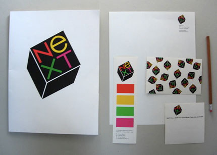
Paul Rand's design for the NeXT logo, for Steve Jobs. He presented in the form of a book, which is so simple and brilliant. See Steven Heller's post on this and the book, here.

Monday, November 7, 2011

Buckminsterfullerene

A deformable cover (1) - Coverjunkie.com

'via Blog this'


Novum 11/11 – Making Of Cover from Paperlux on Vimeo.

Such fucking brilliant awesomeness. Shit. I mean, I've made Buckminster Fuller's geodesic domes before, but the mechanized process is just awesome. I can't get over the suction thingies just sucking the paper up, around 02:42. I want to own this magazine too, just so I can play with the cover and the pretty colours.

Buckminster Fuller is the first famous famous architect I heard of, back in science class at school. I still think he's, well, somewhat superior to the other starchitects because he imagined nature before it was discovered- his geodesic dome structure is repeated in the carbon isotope named after him.

My attempt at the dome, around 2 years ago now:

Wednesday, October 26, 2011

Documenting Delhi

Author Tarquin Hall introduced me to an unusual Delhi slum in The Case of the Man who Died Laughing (2010):
The slum, one of Delhi's largest, was inhabited almost entirely by street entertainers: puppeteers, snake charmers, bear handlers, musicians, acrobats, troupes of actors who performed plays with social messages, the odd story-teller, and jadoo wallahs. But the view through the scratched, convex windshield was depressingly familiar: a sooty ghetto of ramshackle brick houses smothered in cow dung patties. Plastic sheeting, chunks of concrete, and twisted scrap metal were draped over roofs. Canvas tents were pitched amidst heaps of garbage where filthy, half-clad children defecated and played.
Hall went on to describe the incident in such vivid detail that it was a clear, crisp movie playing in my mind- in fact, when trying to recall where I had previously come across the slum, I had to discard the idea of a movie/ video, it seemed that real. Anyways, and again, credit to Tarquin Hall, I was so enthralled by the book that I forgot my intention to google the slum: he never even mentioned its name, only that it's in Shadipur.

It's called the Kathputli Colony, where wandering magicians and entertainers settled sometime in the 1950s, on public land which was then barren, but now prime property, courtesy of the Metro.


The name seems familiar-ish now that I know what it is, as if it was always on the edges of my consciousness. I'm sure I've come across it before.

This post was prompted by this brilliant trailer (and appeal) for Tomorrow We Disappear, a documentary by American filmmakers Jim Goldblum and Adam Weber.

The slum land now belongs to a private developer, so it's most probably in its last days, soon to become another entry in the long list of lost traditions and quirks that made Delhi Delhi. I'm not saying that slums are good, and need to be conserved. But I certainly think that the art and culture of this particular slum needs to be saved- or at least, remembered.

Jim and Adam are attempting to do exactly that- their movie will document Kathputli Colony as it is today. (As far as I know, it does not aim at stopping the eviction.)

The clips they have are beautiful. Also, I love the music they chose.


__
This project is similar to HandpaintedType, by which graphic designer Hanif Kureshi is attempting to preserve the tradition of street-painting. You know, the painters who sit on roadsides and make posters/ banners/ car number plates. Before watching this video I never fully appreciated their skill. All I had were semi-curious half thoughts about how exactly they do it (especially since I've been required to draw guidelines for my text) - do they draw guides, do they use rulers, do they make a first draft, do they outline and and then fill-in later? Now I know, some-what.


Painter Kureshi from hanif kureshi on Vimeo.
__
Came across Tomorrow We Disappear on Kickstarter, which is an awesomely brilliant platform where creative-types can get funding for their ideas and projects. (In a seemingly-random-but-obviously-preordained coincidence, Kickstarter was mentioned in three of the blogs I follow, all on the same day. Crazy.) Discovered so many interesting and quirky and intelligent and crazy (good and bad) and so-obvious-why-didn't-someone-think-of-it-before ideas! Here are some of my favourites:

  1. Ruler Pencils, rulers on pencils (product design) (!)
  2. The Present, an annual clock (product design)
  3. Typographic wall calender (graphic design)
  4. The Montserrat typeface (typography) (another attempt at documenting the intangible culture of a place before it's lost)
  5. Romo, the smartphone robot (technology) (so crazy and cute!)
__
How is it that expats/ foreigners/ tourists sometimes (often) know your city better than you do? Tarquin Hall is a British journalist, Jim and Adam are American, and recently I (with Delhi Dallying and friends) participated in a surprisingly tough Delhi quiz hosted by another British journalist, Sam Miller, and which was (surprise!) won by other foreigners (of unknown nationality).
__
Also, Happy Diwali!


Saturday, October 15, 2011

Designing the life and death of

How the Newsweeklies Covered (and Designed) the Death of Steve Jobs - Grids - SPD.ORG - Grids:

'via Blog this'


Amazing article on what went on behind-the-scenes at Time, Bloomberg Businessweek and Newsweek. Reading about the sheer energy and the commitment driving each team-member as they worked towards the absolutely brilliant covers and spreads is exhilarating. And since the decision to go with special issues focusing entirely on Jobs was so last-minute (for obvious reasons) the office environment doesn't seem much different from an all-nighter the day before the final for a group project. When you're just so crazily focused on making the deadline, it's like a major case of tunnel vision. Seriously, you have to live it to believe it. Rohan, Varun and I got the crazies while trying to finish ANDC: I reached home at 3 in the night, no lunch, no dinner, but many phone calls and lets-abuse-the-battery-backup-limitations-of-our-laptops sessions and even more place hopping later. We went from Ghaziabad to Indirapuram to hostel to New Friends to Julena to ITO to hostel to Julena, all in the course of some 7-8 hours, in the pursuit of a working plotting machine.

I want to own all the three magazines. Time and Newsweek for the brilliant cover-photographs, but especially Bloomberg Businessweek because the cover-back spread is printed on a metallic silver base. Gah.

Friday, October 14, 2011

Art is for everyone

From Art Direction Explained, At Last!, an imaginary (but well researched) conversation between legendary graphic designer Pierre Bernard and maverick adman Pascal Gregoire:

GREGOIRE: Wait a minute! Weren't you also mixing codes with your Louvre logo? You used a black-and-white photograph of a cloud as the background for the word LOUVRE, spelled out in all caps. The letters look like they have been carved out of marble, yet they float in space. It makes no sense.
BERNARD: I was trying to convey the idea of grandeur, something associated with the Louvre institution, but also with the concept of public space and the democratic values attached to it. Originally, I had proposed a logo inspired by I.M. Pei's pyramid, but he vetoed it. It was written in his contract that the only triangle would be his triangle. So I decided to evoke the presence of the glass pyramid by integrating in the design of the logo a photograph of the cloudy Parisian sky as seen through Pei's iconographic skylight. 
I learnt many things from this anecdote. One of which is: I.M. Pei has a hell of an ego. 

Monday, October 3, 2011

ideo-

Words divide, pictures unite.
and
Words are pictures too.
___

Ideograms and ideographs convey ideas without explicitly stating them.
___
From the Online Etymology Dictionary:
idea
late 14c., "archetype of a thing in the mind of God; Platonic `idea,'" from L. idea "idea," and in Platonic philosophy "archetype," from Gk. idea "ideal prototype," lit. "the look of a thing (as opposed to the reality); form; kind, sort, nature," from idein "to see," from PIE *wid-es-ya-, suffixed form of base *weid- "to see" (see vision). Sense of "result of thinking" first recorded 1640s.
___
From V for Vendetta (2006):
But what of the man? I know his name was Guy Fawkes and I know, in 1605, he attempted to blow up the Houses of Parliament. But who was he really? What was he like? We are told to remember the idea, not the man, because a man can fail. He can be caught, he can be killed and forgotten, but 400 years later, an idea can still change the world. I've witnessed first hand the power of ideas, I've seen people kill in the name of them, and die defending them... but you cannot kiss an idea, cannot touch it, or hold it... ideas do not bleed, they do not feel pain, they do not love... And it is not an idea that I miss, it is a man... A man that made me remember the Fifth of November. A man that I will never forget.
and
Beneath this mask there is more than flesh. Beneath this mask there is an idea, Mr. Creedy, and ideas are bulletproof.
From the V for Vendetta graphic novel by Alan Moore and David Lloyd

Tuesday, September 20, 2011

of news and other things.

Boulevard du Temple by Daguerre
The oldest photograph of a person, 1838.

From wiki:

Boulevard du Temple, Paris, 3rd arrondissement, Daguerreotype. The purportedly first picture of a living person. The image shows a busy street, but due to exposure time of more than ten minutes, the traffic was moving too much to appear. The exception is the man at the bottom left, who stood still getting his boots polished long enough to show. Look closely and you will also see another man sitting on a bench to the right reading a newspaper. Also in the upper left hand side you can also see another man standing under the awning of the 3rd building from the left. What looks to be a woman standing under the street lantern at 10 o'clock from the man getting his shoes shined and another one in the big white building,1st row 3rd window down. Notice the child in the top floor window of the white building in front. Note that the image is a mirror image.

10 minute exposure time is so crazy. I mean, none of the carriages (cars?) are visible, and it's not like they're super fast either.

Got this from the 1000memories blog post How many photos have ever been taken? which has some other crazy stuff. Sample this:

I just don't understand why it's all so PINK.
Not really a surprise, but still, I DID NOT imagine that Facebook would have so many more photographs than other libraries.

This post is via Charles Apples' blog on newspaper/ magazine design. Also discovered via him: the Nueseum website's Today's Front Pages webpage which, well, showcases the frontpages of newspapers from around the world (but mostly within the USA). The Nueseum also displays newspaper frontpages outside its building along the public sidewalk.The Nueseum's in Washington, and while we didn't visit it, I remember clearly its very dramatic (and impressive) facade:

Excuse the random composition. Taken when on the move.
I wonder: is this mannerism, as defined by Robert Venturi? An example of the decorated shed and not the duck. Fits in well with the WordWeb definition of mannerism: A deliberate pretence or exaggerated display. In any case, I think it works really, really well.

Some other interesting links:
sans serif: on the latest behind-the-scenes happenings in Indian news and media. Offers pretty much what the tagline offers: the news. the views. the juice.
Information is Beautiful: on infographics- simply put, graphics which covey information. Some really-fucking-brilliantly-amazing work. (via Rachit)
History of Graphic Design: Just how beautiful is this site? Sigh.