Showing posts with label typography. Show all posts

Tuesday, May 1, 2012

please type chandigarh

on the door of the Gandhi Bhavan auditorium, Punjab University campus.
I visited Chandigarh this past weekend. We stayed at the JW Marriot, which (however luxurious from the inside) was absolutely ugly from the outside and didn't respond to it's context at all. However, there was one redeeming feature:

all the signage was on metal panels with the Golden Ratio spirals!
also, for some reason, all the full stops were dropped/hanging. anyone know the logic (if any) behind this? 
You can see my other photographs here.

Saturday, March 10, 2012

On the net

Ankhen, 1968
I absolutely love this poster. The typography, and the eyes, all four of them.

The movie's on youtube, and I'm just starting to watch it. Hope the title sequence is as awesome as it seems!

Friday, February 24, 2012

the typewriter

I'm not sure of the protocol here, although I'm pretty sure I'm going against it. But I just couldn't resist! On a visit to a client's flat (which needs to be renovated from a nursery school to a family home), I discovered this:

From what Google tells me, this is a version of the first commercially successful typewriter, manufactured by the American firm of E. Remington and Sons. I wasn't able to pin down the exact model from the quick  photographs I took, the quality of which you must excuse; I only had my phone and I was all too worried about the clients returning and having to give an embarrassing explanation to be able to take my time.

From a great article on Remington Portables:
The Remington portable typewriters of the twenties and thirties are a familiar sight in antique shops and flea markets across the U.S. (not to mention eBay). Many of them are charming and attractive, and there are few collectors who don't have at least one. However, it is difficult to find information about these machines. They were produced in bewildering variety, with a wide range of names and minor variations. 
And this was just lying there, abandoned! I wish I had the guts to steal it -or even ask the clients about it. Maybe I can do that the next time I see them. But, ah, if only wishes were horses...


Saturday, February 4, 2012

Notes

I've joined vir.mueller architects as a trainee.

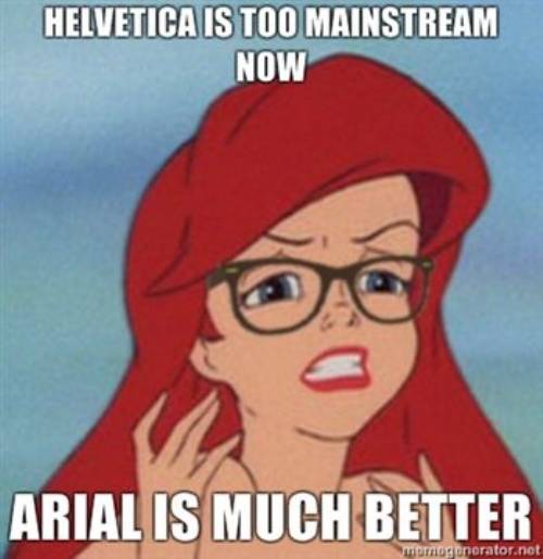
They only use the font Helvetica.
(Actually, Swis721 LT, but that's what Helvetica is called on Windows)


link via Rohan Patankar
My parents went to the US for a conference, where they met people from all over the world, and exchanged gifts. My loot: two awesome Indonesian bookmarks representing the Hindu mythology characters Srikhandi and Rama.


Found online:
here.
Currently reading What on Earth Evolved? 100 Species that changed the world by Christopher Lloyd.

Wednesday, January 11, 2012

Friday, November 25, 2011

Discoveries

during the INTACH Heritage Walk through Old Delhi, 13 November, with Sohail Hashmi.

 some BRILLIANT typography:
and some old and broken violins:

Friday, November 18, 2011

Love and type, 2

Via this post at I LOVE TYPOGRAPHY:


This is brilliant! A sort-of collaborative effort which offers exercises aimed at getting people better at design, entrepreneurship and gardening. Can't wait for it to launch properly, considering that it's already got two AWESOME (one more than the other) typography tools to play with.

Kern= the spacing between two letters.


Both these games are quite simple and depend on instinct- what looks or feels right. I was, obviously, better at kerning than shaping- 89 compared to a 79 in the latter. But great fun.

Also, again via the same post:

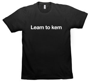
A 'learn to kern' T-shirt! Available here.

Wednesday, October 26, 2011

Documenting Delhi

Author Tarquin Hall introduced me to an unusual Delhi slum in The Case of the Man who Died Laughing (2010):
The slum, one of Delhi's largest, was inhabited almost entirely by street entertainers: puppeteers, snake charmers, bear handlers, musicians, acrobats, troupes of actors who performed plays with social messages, the odd story-teller, and jadoo wallahs. But the view through the scratched, convex windshield was depressingly familiar: a sooty ghetto of ramshackle brick houses smothered in cow dung patties. Plastic sheeting, chunks of concrete, and twisted scrap metal were draped over roofs. Canvas tents were pitched amidst heaps of garbage where filthy, half-clad children defecated and played.
Hall went on to describe the incident in such vivid detail that it was a clear, crisp movie playing in my mind- in fact, when trying to recall where I had previously come across the slum, I had to discard the idea of a movie/ video, it seemed that real. Anyways, and again, credit to Tarquin Hall, I was so enthralled by the book that I forgot my intention to google the slum: he never even mentioned its name, only that it's in Shadipur.

It's called the Kathputli Colony, where wandering magicians and entertainers settled sometime in the 1950s, on public land which was then barren, but now prime property, courtesy of the Metro.


The name seems familiar-ish now that I know what it is, as if it was always on the edges of my consciousness. I'm sure I've come across it before.

This post was prompted by this brilliant trailer (and appeal) for Tomorrow We Disappear, a documentary by American filmmakers Jim Goldblum and Adam Weber.

The slum land now belongs to a private developer, so it's most probably in its last days, soon to become another entry in the long list of lost traditions and quirks that made Delhi Delhi. I'm not saying that slums are good, and need to be conserved. But I certainly think that the art and culture of this particular slum needs to be saved- or at least, remembered.

Jim and Adam are attempting to do exactly that- their movie will document Kathputli Colony as it is today. (As far as I know, it does not aim at stopping the eviction.)

The clips they have are beautiful. Also, I love the music they chose.


__
This project is similar to HandpaintedType, by which graphic designer Hanif Kureshi is attempting to preserve the tradition of street-painting. You know, the painters who sit on roadsides and make posters/ banners/ car number plates. Before watching this video I never fully appreciated their skill. All I had were semi-curious half thoughts about how exactly they do it (especially since I've been required to draw guidelines for my text) - do they draw guides, do they use rulers, do they make a first draft, do they outline and and then fill-in later? Now I know, some-what.


Painter Kureshi from hanif kureshi on Vimeo.
__
Came across Tomorrow We Disappear on Kickstarter, which is an awesomely brilliant platform where creative-types can get funding for their ideas and projects. (In a seemingly-random-but-obviously-preordained coincidence, Kickstarter was mentioned in three of the blogs I follow, all on the same day. Crazy.) Discovered so many interesting and quirky and intelligent and crazy (good and bad) and so-obvious-why-didn't-someone-think-of-it-before ideas! Here are some of my favourites:

  1. Ruler Pencils, rulers on pencils (product design) (!)
  2. The Present, an annual clock (product design)
  3. Typographic wall calender (graphic design)
  4. The Montserrat typeface (typography) (another attempt at documenting the intangible culture of a place before it's lost)
  5. Romo, the smartphone robot (technology) (so crazy and cute!)
__
How is it that expats/ foreigners/ tourists sometimes (often) know your city better than you do? Tarquin Hall is a British journalist, Jim and Adam are American, and recently I (with Delhi Dallying and friends) participated in a surprisingly tough Delhi quiz hosted by another British journalist, Sam Miller, and which was (surprise!) won by other foreigners (of unknown nationality).
__
Also, Happy Diwali!


Thursday, September 15, 2011

Love and Type

WhatFont
Great Google Chrome app which identifies (most of) the fonts used on a web page.

Free (and easy) online tool to create fonts. There is also amazingly awesome amateur work up for download. 
THIS IS SO MUCH FUN!

work-(hopefully)-in-progress
Meet Your Type
Brilliant, hilarious type guide by FontShop. More of their education resources here.

***
Why do all these typography websites have two word names with no spacing?